(Originally posted 7/22/15 and last edited 11/15/17)
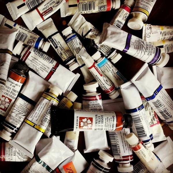
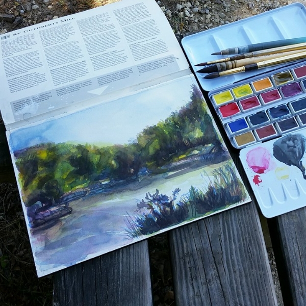
I’ve been getting a lot of questions on how I rank watercolor brands and how they rate against each other. The following is a brief explanation on my personal choices for buying watercolors based on what I’ve used so far. But please do take it with a grain of salt; the reasons that I might prefer them could very well be the same reasons that you might not.
Some of the paint brands were extremely difficult to rank. My general criteria was based on color richness, price, lightfastness, rewetting ability, user friendliness, availability of single pigment colors, and personal taste.
—
1. M. Graham
My first choice and perhaps my all time favorite, these classical American paints are my go-to option. Since these are probably the most controllable paints I’ve worked with, this is what I generally use on commission work. The washes are so easy to manipulate that sometimes I think these paints taught me how to use watercolors. Don’t know if anyone else has that experience though.
The pigments are manufactured to showcase its personality, and it definitely shows in how some of them granulate beautifully. I used to think I wasn’t into granulation effects, but I sure changed my mind after using these. There is something absolutely poetic in a wash of their Ultramarine Blue, and their colors practically hum with intensity. I’m definitely able to get a full range of tones with these paints from deep luminous darks to pale glowing tints.
I’ve noticed that the pricing has gone up a bit, but I can’t see how that’s really going to stop me from using them. While I do very much enjoy other paint brands and might prefer other companies’ pigments for certain colors, this is the brand I would stick with if I was somehow forced to limit myself to one.
Read more in-depth review here.
2. Schmincke
Very clean and forward German paints. An absolute joy to use; I never regret getting these out. In an interesting move, these paints are formulated to have little difference among them for a consistent texture amongst all the colors. Some might like that when aiming for high realism.
What bumped this up to second for me was the all around quality of the paint and the most gorgeous full pans. I love full pans, and though they’re a bit tough to find the Schmincke ones are very well worth the search. Empty pans and metal palettes are also available.
Read more in-depth review here.
3. Winsor & Newton
The very available and well-known English paints. While it may seem like the top choice because plenty of artists use it, I think it’s definitely more because Winsor & Newton has been around for so long and manages to be so ubiquitous in the market.
What makes these paints a good choice for me is that for the most part all the colors are very different and visually distinct. For example, the Pthalo Blue Green Shade looks a lot different from the Pthalo Blue Red Shade. Most brands have them very similar in appearance.
Though maybe not up to the hype it’s generally given, Winsor & Newton is a strong choice and one I will probably use extensively for a long time. I’ve come to adore so many of their colors, especially all the Pthalos, Winsor Violet, Ultramarine Blue, Cobalt, Cerulean, Green Gold, Permanent Alizarin Crimson, Scarlet Lake, Permanent Rose, Quinacridone Magenta, Permanent Violet, Burnt Sienna, and Burnt Umber. I’m open to trying new colors from this brand as well.
I do still find those new metallic tubes horribly ugly. At the very least, the prices thankfully seem to have gone down a bit.
Read more in-depth review here and here.
4. Sennelier
Romantic, optimistic French paints. Perhaps the best bargain on the market right now. I would have ranked it third for the great price, but I bumped it down because I’m simply not as familiar with this paint. I’ve only experimented with the tiny set, and I wonder if I’d rank this higher if I tried their tubes and full pans.
Read more in-depth review here.
5. Holbein
Delicate, very finely milled, transparent Japanese paints. Great in that they are very saturated and easily liftable for errors and effects. What brought Holbein down on the list for me was the passel of fugitive colors and far too few single pigment paints. Worth a go if you’re willing to research what you’re buying, or you just don’t care as much about the technical details.
Read more in-depth review here.
6. Sakura Koi
If you’re not trying to be too serious about watercolor or you’re nervous about starting out with expensive paint, this is a good product to start out with. This is the first brand I used in my later years of high school, and it was good for me to be familiar with the feel of watercolor paint on my brush. Pretty vibrant for student colors.
—
In closing, it’s not necessarily the paint! I could be very happy with pretty much any of these brands and not feel limited in the least. We’re very fortunate to have so many high quality options these days. I hope to update this post in the future as I still experiment with new brands from time to time.

