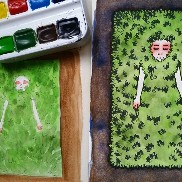
(Originally posted 4/7/15)
Little watercolor metal pan sets with good quality paint are one of my greatest weaknesses, and it seems as though manufacturers get more and more clever at popping them out.
Relatively recently, Sennelier came out with a new formulation for their watercolor paints to have a honey base, similar to the M. Graham paints I love so much. I’ve never used Sennelier’s previous formula, but hardly anyone seemed to rave about them so I didn’t pay them much mind. I bought this cute little tin for my birthday last year to see if it was anything worth fussing over.
And what nice paints! They’re very eager to please and reactivate. With even the slightest dab of my brush, the paint explodes into juicy, crystal clear washes. I feel silly saying this, but these paints weirdly seemed so French and romantic to me. Like I couldn’t get the image of 19th century France with someone along the Seine. Honey must do a big thing in watercolor formulas since the extra richness is definitely noticeable. Strangely, I’ve also noticed that they seem to have more of a tendency towards back runs and textures though M. Graham’s honey formulation smoothens out the washes to avoid this.
In a gesture I most appreciate, the paints included are listed in the back with the swatch, pigment information, opacity level, and the lightfastness. Very handy, saves me a spot time. The free brush is too small to really be of any use to me, so I’ve never used it. I’d rather use a waterbrush anyway when I’m on the go.
I surprisingly don’t mind the palette. I usually don’t care for having pigments selected for me, but I found the choices very sensibly made. For quick sketching you really don’t need very much to get your point across, and I haven’t yet found myself too limited by it.
I like nontoxic, lightfast, and transparent colors when I’m sketching, and for the most part I didn’t find any color particularly unnecessary. Except for the Pthalo Green Light. I don’t mind it too much, but perhaps a Yellow Ochre would’ve been a better option for landscapes. I also found myself longing for a rose paint with a cold bias. Maybe a nice Quinacridone.
The Payne’s Gray is especially beautiful. A great mixer, it makes wonderful deep silvery greens with the Sap Green provided. It was so lovely I felt drawn to make more monochromatic studies simply to watch the color spread over the paper.
I must say, from a design standpoint I’ve been very impressed with their marketing and packaging. Packaging for me is a pretty big deal, since I personally believe a lack of care in design is usually a good indicator of a potentially poor product. The set itself is very cute and small enough to fit in my pencil case for quick sketches or self induced art therapy.
Anyway, these are great paints and judging from my experiences with this tiny set I might even consider getting some of those excellently priced tubes in the future.
